At The Bar N’ Bar, At The Bar N’ Bar, we’ve spent years sticking our heads into the bar rails, kitchens, and numbers of hundreds of hospitality businesses. We work side-by-side with you so your business runs like a Swiss watch, generates real profits, and lets you sleep at night. And if there’s one thing we’ve learned on this journey, it’s that your guest’s experience no longer starts when they sit at your table, but much earlier: on their phone screen when looking for a place to eat.
The pace of life in cities like Madrid or Barcelona has completely broken the clocks of traditional hospitality. Eating strictly at 2:00 PM and dining at 9:00 PM is ancient history. Real profitability in modern hospitality lies in the non-stop model or continuous kitchen service. Breakfasts stretch out into brunch, lunch merges into the after-lunch chat (sobremesa), and that naturally flows into the afternoon-drinking phenomenon known as tardeo. The tardeo trend,
which consolidated heavily after the pandemic, already accounts for 26.5% of total revenue for leisure venues in Spain. In regions like Galicia, it has grown by 40% in a single year, representing 19.5% of their income. Plus, tardeo pulls in a guest with an average age of 43 and a mean spend of €25 per person—a highly attractive ticket that gives breathing room to business margins.
If your kitchen closes in the afternoon, you are eating the fixed costs of your rent, electricity, and gas during the deadest hours of the day without making a single euro in revenue. By opening a continuous kitchen, you amortize those structural costs and capitalize on the hours of peak spontaneous social consumption.
Of course, operating a non-stop schedule demands flawless staff coordination. You need to plan your cooks’ and waiters’ shifts intelligently using real-time tools to avoid your labor costs skyrocketing and destroying your profitability.
1. The Ghost Menu in PDF Format (The Number One Enemy of Your SEO)
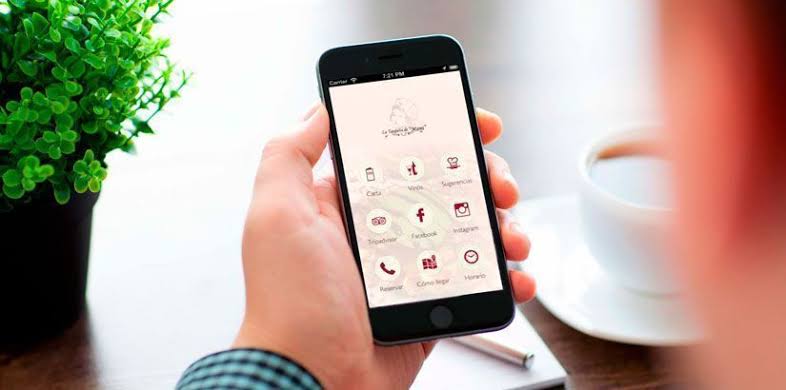
Imagine a potential customer walking down the street on a Thursday at 6:00 PM with a ravenous hunger. They pull out their phone, search for your venue online, and click the link to see what you offer. What they find is a button reading “View Menu” that forces them to download a heavy 15-megabyte PDF file.
On mobile devices, a PDF menu is a cardinal sin of usability and design. It forces users to eat up their data, wait out a slow download, and perform thumb gymnastics with continuous pinching and zooming just to read dish names and prices on a tiny screen. pinch-to-zoom.
2. Your Website Loads at a Snail’s Pace and Isn’t Built for Mobile
The patience of a digital consumer is clocked in milliseconds. If your restaurant’s website takes more than 3 seconds to load on a smartphone, over half of your visitors will bounce before seeing a single shot of your food. Google measures this speed with a magnifying glass and penalizes slow sites in its search results, burying them in rankings where nobody clicks. Google measures this speed with a magnifying glass and penalizes slow sites in its search results, burying them in rankings where nobody clicks.
The primary reason hospitality sites crawl is the unoptimized weight of their food photography. Uploading high-res images straight from a photographer’s camera without compression is like trying to run a marathon dragging a sack of cement. Images must be compressed and saved in next-gen formats like WebP or AVIF, stripping their size down from 4 megabytes to under 100 kilobytes without losing a single drop of their visual appetite.
3. Forcing Guests to Call You or Slide into Your Instagram DMs to Book
The modern guest hates talking on the phone for routine tasks. Forcing someone to call, wait until the manager has a free second mid-service to pick up, check for an open table, and scribble it down by hand in a paper book is a non-stop source of errors and a massive time drain for your team.
Even worse is lacking an online booking engine and splashing messages on your site like: “To book, send us a DM on Instagram” or “Email us 24 hours in advance.”. This is commercial suicide in an era of immediacy. If a user decides to grab a bite at your spot on a Saturday afternoon and can’t lock down their table instantly, they will leave and look for a venue that gives them real-time confirmation.
4. Ignoring the Technical Language Google Speaks (The Absence of Schema Markup)
Here is where we solve the mystery of Carlos, our client from Chamberí who was dropping €8,000 a month because of his website.. His site was beautiful and fast, and it even featured a fantastic booking button. But Carlos made the mistake of leaving his hours, menu, and contact details in plain text without “labeling” them internally for search engines.
Google uses a technical language invisible to human eyes called structured data or Schema Markup.. It’s a hidden snippet of code that tells the search engine explicitly: “This is the restaurant’s opening hours,” “This is the price of the ham croquettes,” and “This is the button to book a table.” This hidden layout is exactly what allows Google maps to display your live schedules flawlessly instead of blacklisting your traffic.
5. Artificial Stock Photos and a Total Lack of Real Shots of Your Food
Is there anything sadder than entering the website of a pizzeria in Madrid and seeing a stock photo of a New York model biting into a hyper-perfect, industrial slice of pizza? Generic catalog images strip away all the personality and authenticity of your venue. It stands out from miles away that they aren’t real, and guests instantly assume that if your photos are fake, your dishes will be too.
6. Hiding Your Contact Info and Forgetting to Tell Guests What to Do (Hidden CTAs)
Sometimes web designers get a bit too modern and forget the absolute basics: making it easy for the user. It’s incredibly common to find restaurant sites with beautiful minimalist designs where hunting down the address, phone number, or opening hours turns into a headache.
The customer doesn’t want to play detective or run an investigation. They want to land on your site and answer three questions in three seconds: “Where is it?”, “When does it open?”, and “How do I book?” . These three elements must always be visible and accessible right at the top of your page (above the fold) without requiring a single scroll. These three elements must always be visible and accessible right at the top of your page (above the fold) without requiring a single scroll.

7. The Visual Frankenstein’s Monster (Inconsistent Branding) and a Ghost Town of Reviews
The last major blunder is building your brand image out of mismatched scraps. If your Instagram account rocks a fun tone and modern photography, but your restaurant’s website looks like a 1990s tax consultancy office with boring copy and outdated fonts, you are screaming visual disorder and a lack of professional criteria.
Your website shouldn’t just look pretty; it needs to put numbers on your sheets and guests in your seats. If you want to stop guessing, clean up your digital presence, and build an online experience that converts casual browsers into loyal regulars, we are right here to make it happen.
We know the industry, we know the codes, and we know what makes a digital strategy click.